How can a system enable product teams to work together efficiently while creating a consistent design across a decade-old platform?
On the back of a platform-wide design audit in my first month as Product Design Manager, I set a goal to create a design system to improve design and development efficiency while increasing the consistency of our platform. Until that point, the team had never worked with a design system, meaning that features developed over the years had no consistency in their look, feel, or usage.
In addition to frustrating users, designers had no bounding guidelines to work within and the development handoff left many questions unanswered.
Creating consistency
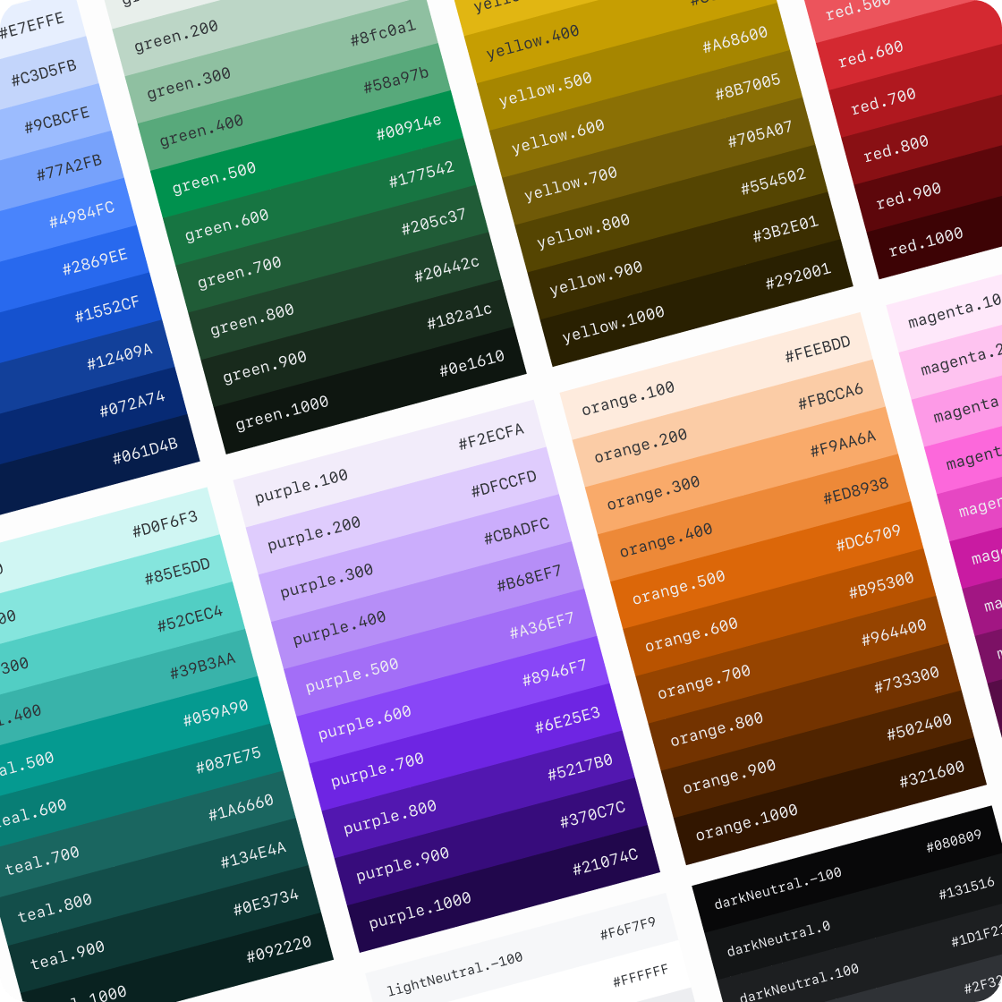
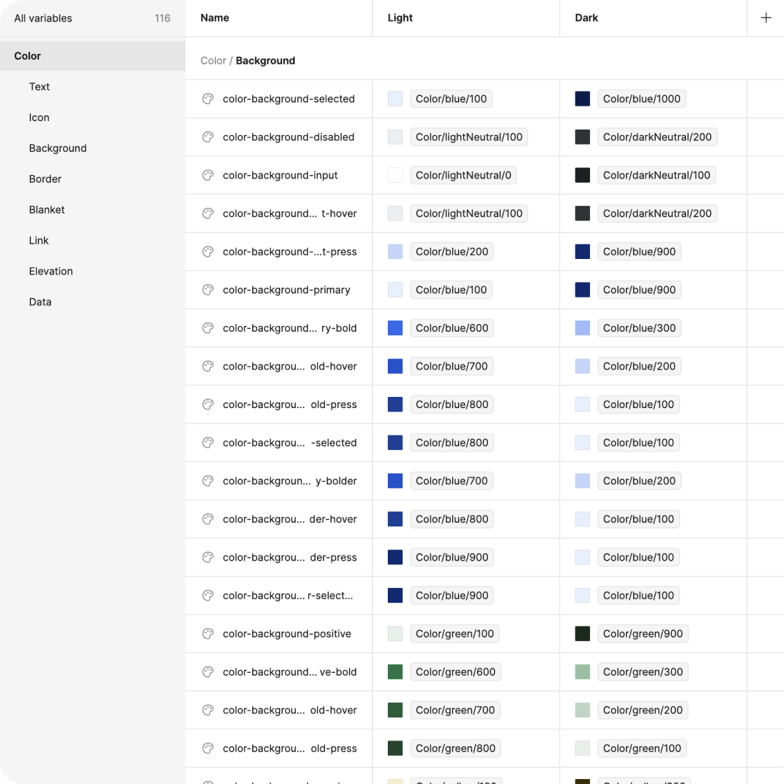
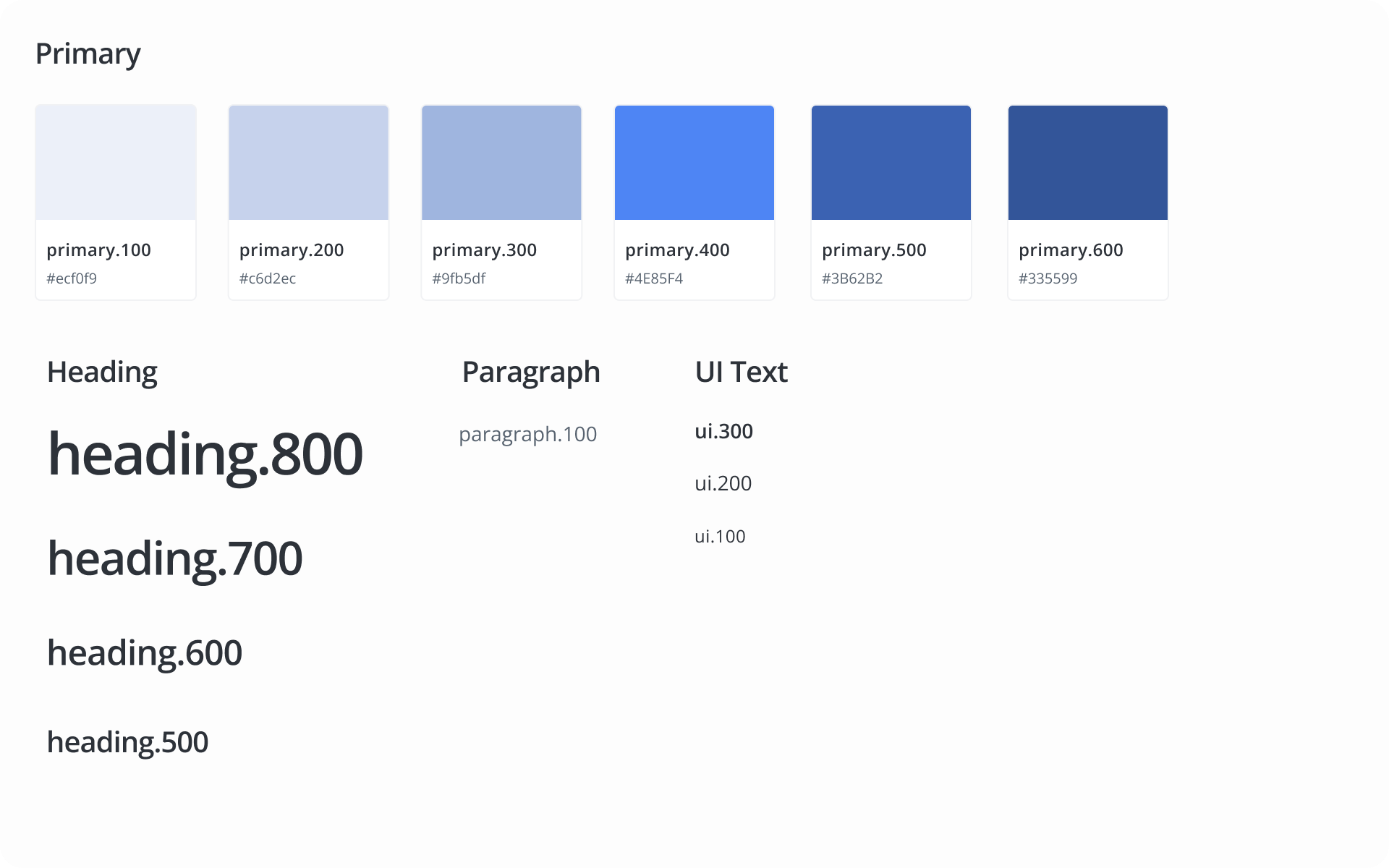
My first step was to simplify the vast number of colours and type styles currently present in the platform. This ensured we had only the variations we needed to work with, and nothing more. These styles could always be expanded in the future.
Piece-by-piece, step-by-step
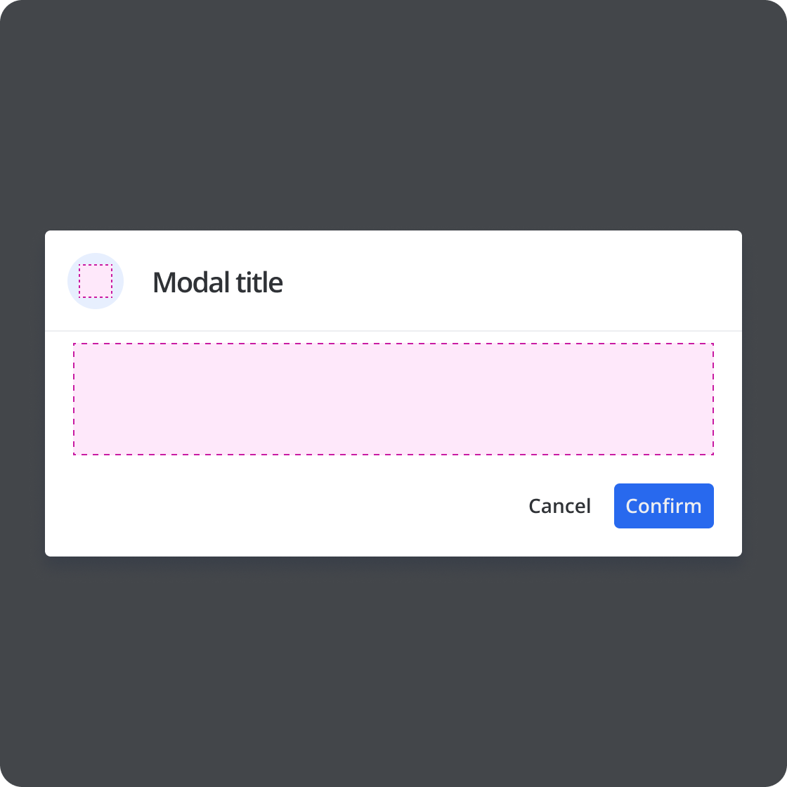
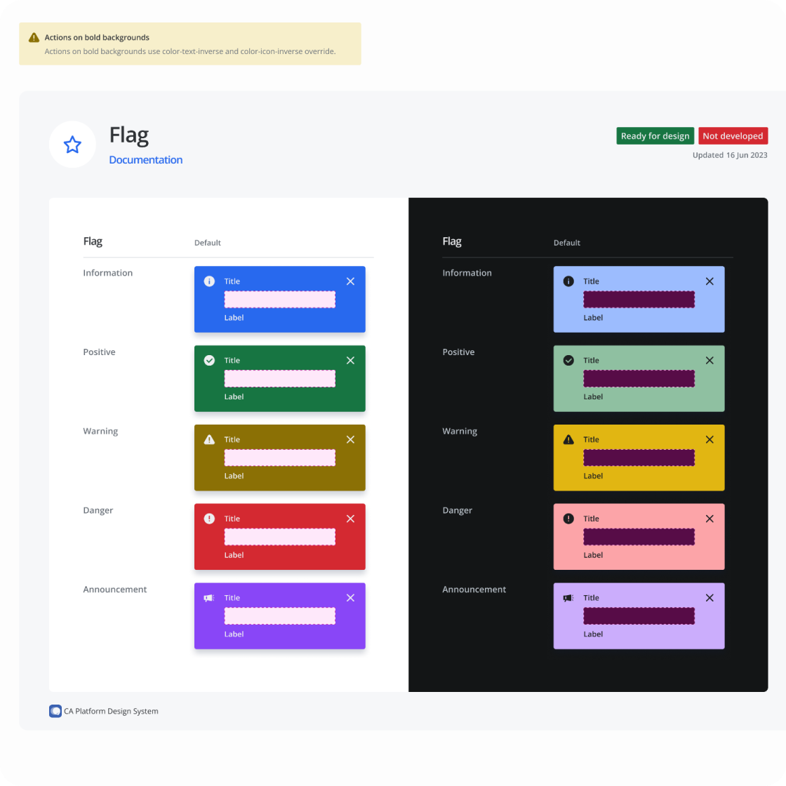
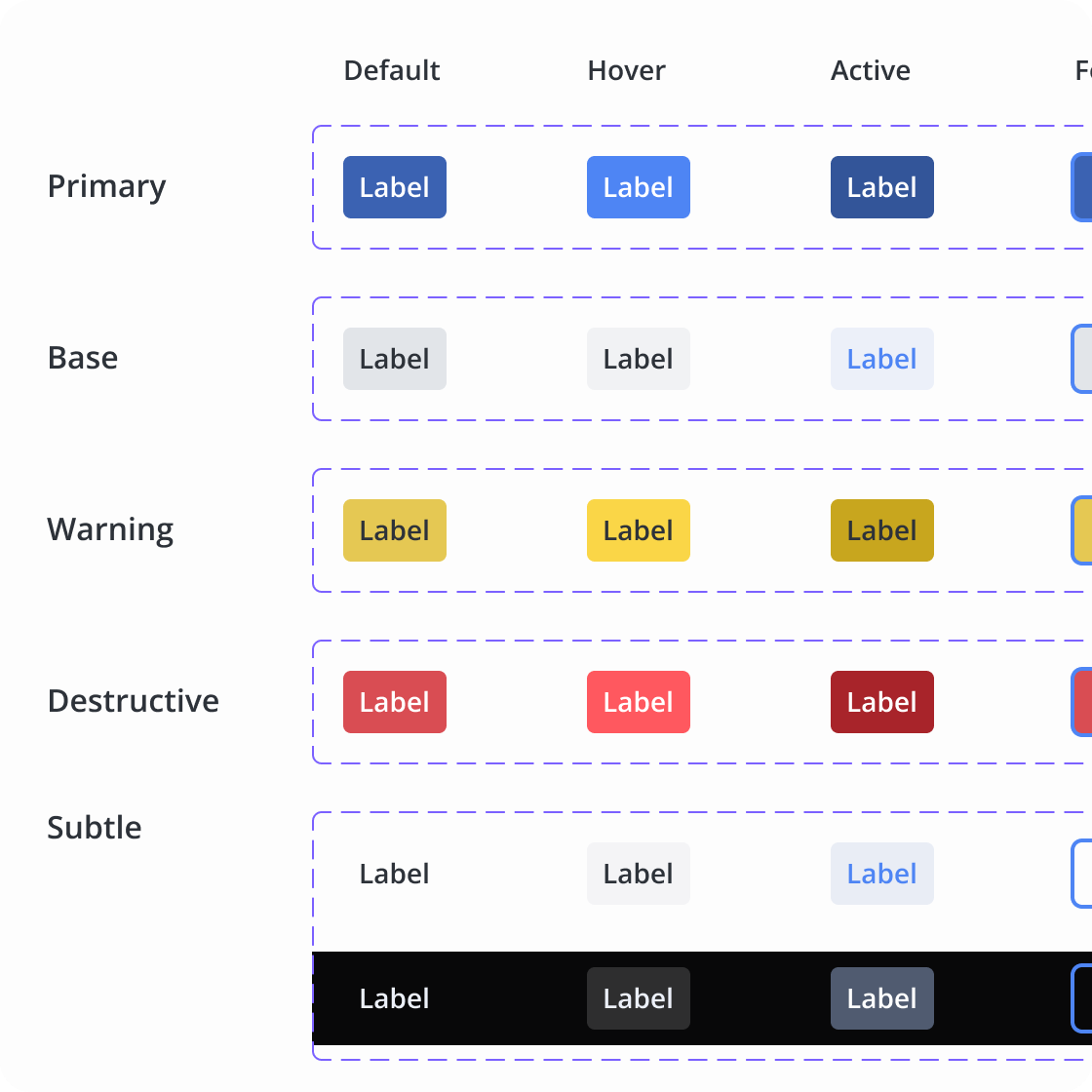
With the foundations defined, my team and I began to build out components as needed, starting with the basics: buttons, input fields, and modals.
Cross-team advocacy
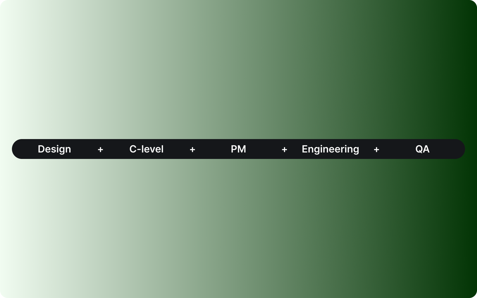
As the person responsible for our product design team, I was able to make the decision to build a design system on my own. However, it also required me to advocate for time and budget to fit the work into our roadmap. I worked closely with leadership, product managers, and the engineering team to ensure we never worked in a silo, building out a design system that was collaborative from the beginning.
Discovering the benefits
I knew that once the bulk of our design system was built out, we would begin to design and release much faster. In addition, our quality assurance team was able to benefit directly from our work. The documentation we created in Figma and zeroheight enabled the QA team to test exponentially faster.
Advocating for systems-thinking also pushed our engineering team to think more holistically about creating components. With this push, the team also began to take long-delayed steps to drastically reduce front-end tech debt and upgrade frameworks.
Outcome
The work the team did to implement our design system enables designers to spend less time creating great solutions, removes years of tech debt, and empowers the whole product team to create value for our customers faster.
Continuous updates
After a year of work on the first version of our design system, I identified areas where the system could be improved even more. With the help of one of the designers on my team, I drove these updates as OKRs to: create a better component structure using slots and local components, write even easier to understand documentation for designers and developers, expand our colour palette, and double down on tokens.